“Comfort you can taste!”
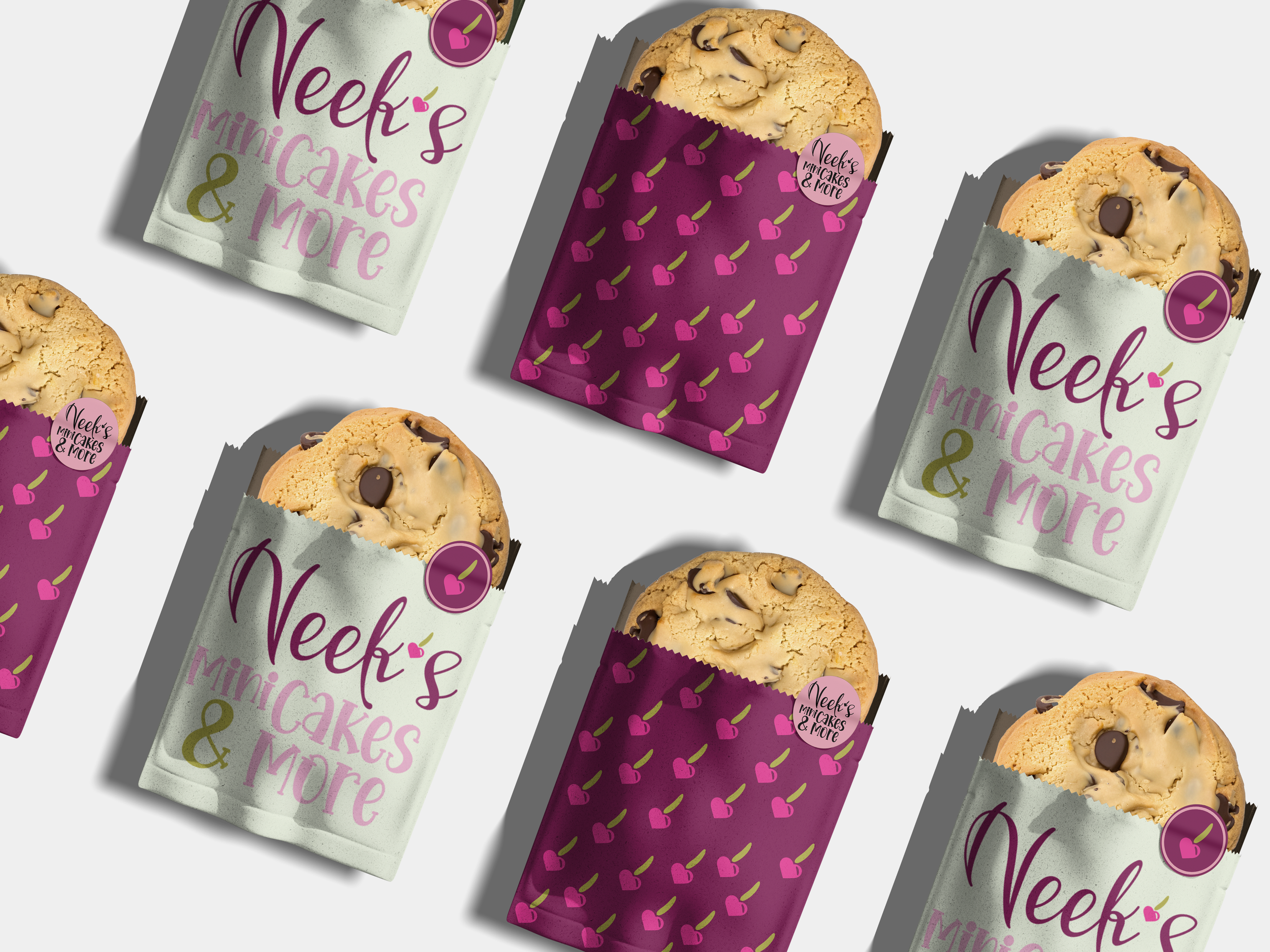
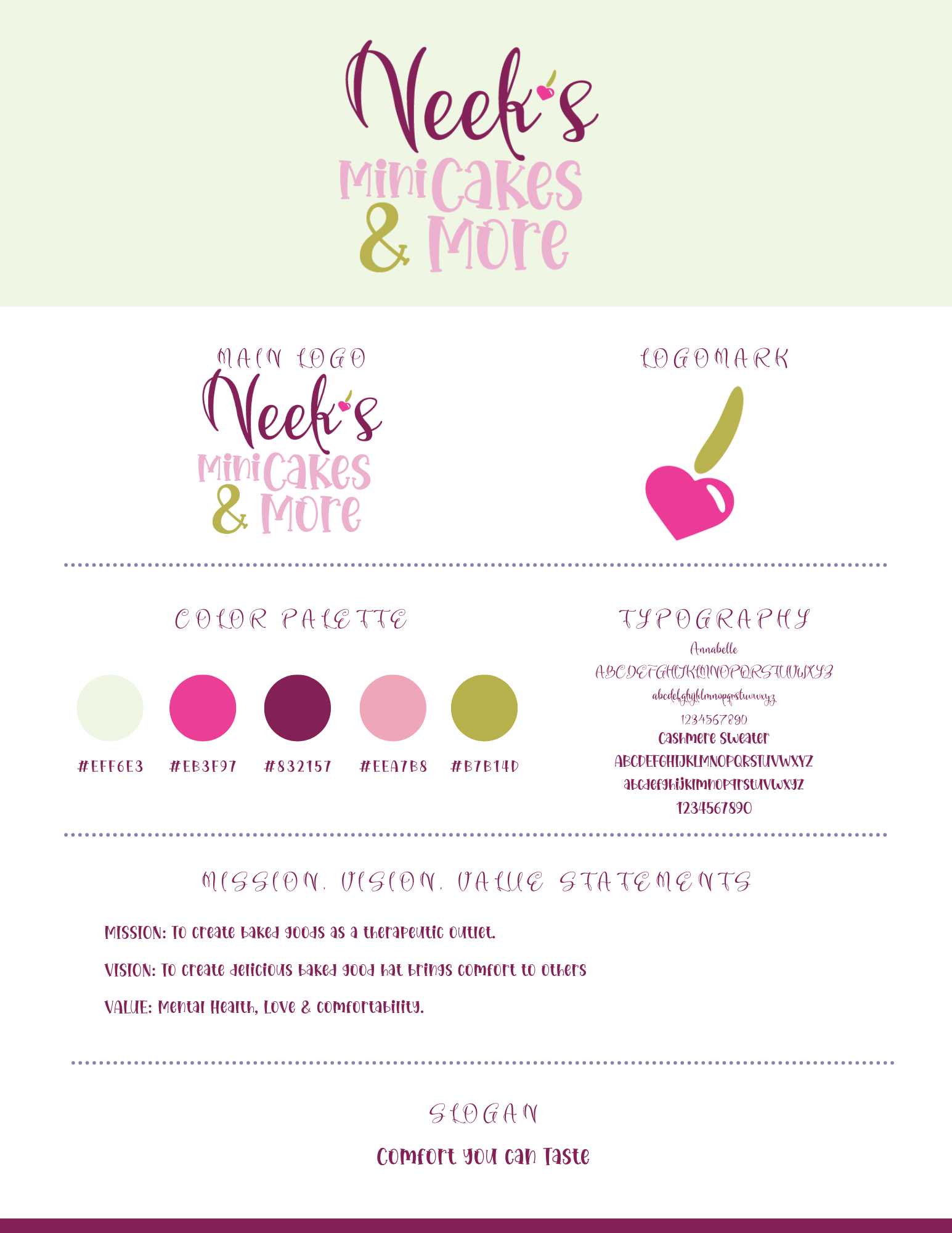
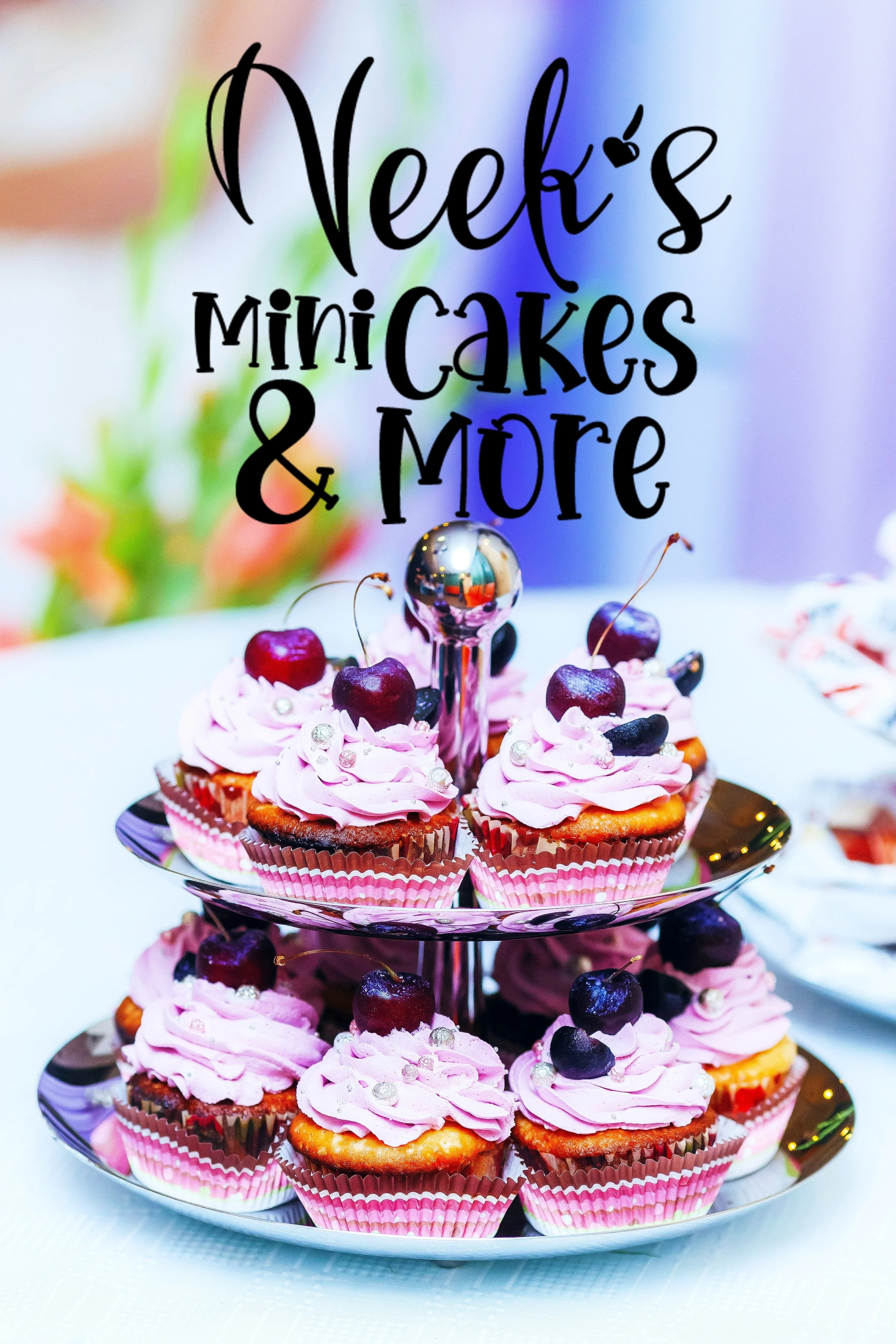
When the owner of Neek’s approached me, she was looking for a brand that reflected her and the story behind the brand. She wanted feminine, simple, and grounded. Being a home baker, she wanted her brand to be as inviting as her baked goods. Overall, she wanted to share the healing comfort that baking has ha for her in both her brand and sweets. I started by looking for a color palette that would fit her soft personality, along with typography that brought a fun, playful aspect to the brand. When it came to iconography, we agreed something playful but simple would fit best. The heart-shaped cherry gives a nod to the playful and caring nature of the owner herself, giving the brand a custom mark that truly feels like an extension of her.
